CuraLinc Healthcare · Oneinfive
Independent interview design exercise · 2022
One brief.Four formats.One connected campaign.
A mental-health awareness concept that began with an employee booklet and grew into a coordinated family of print and digital communications.
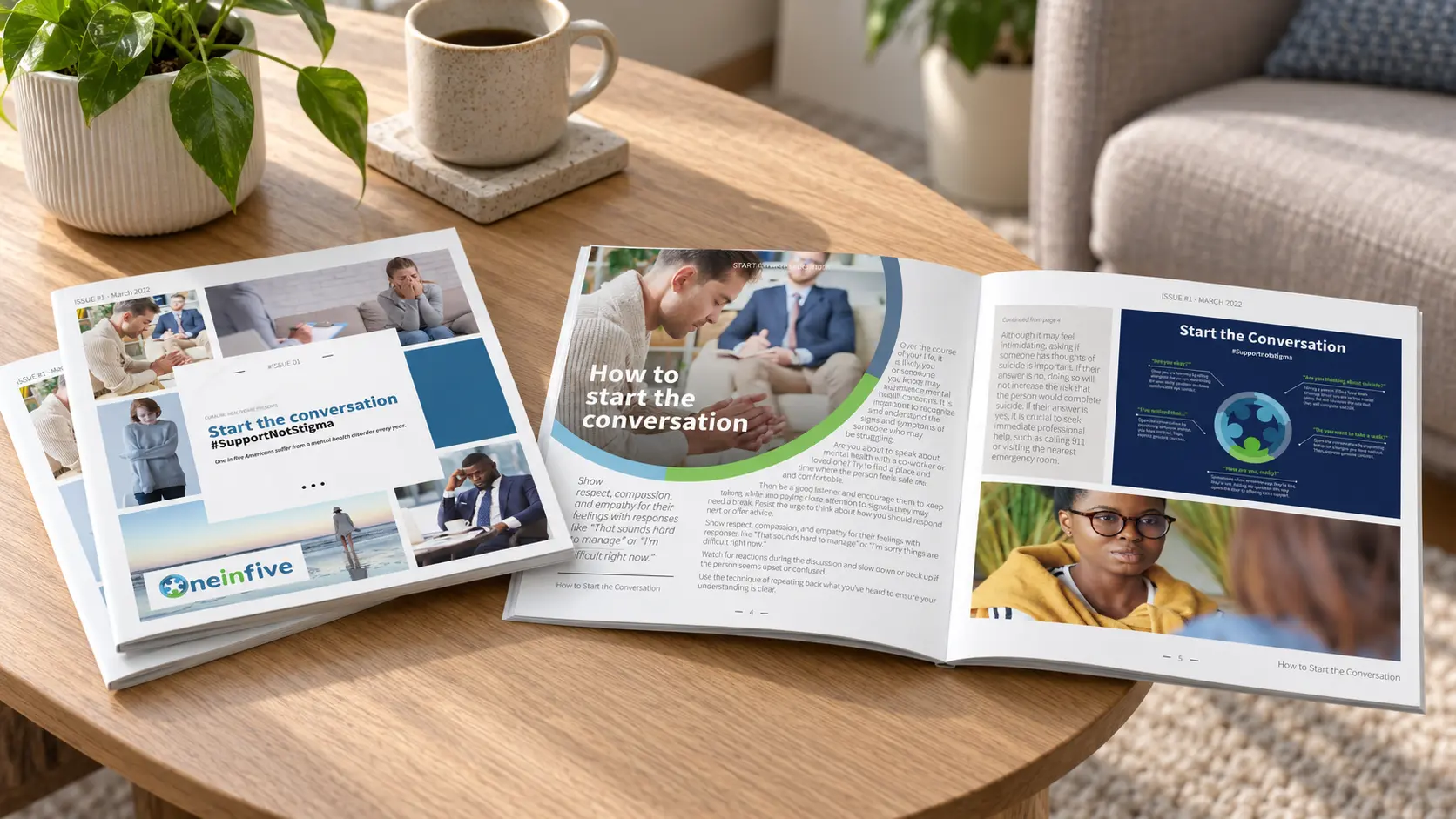
Role
Independent designer
Concept through presentation
Context
Second-round interview
Design exercise
Deliverables
8-page booklet · 2 flyers
2 social posts
Tools
Adobe InDesign
Adobe Illustrator
Case study summary
Create a promotional piece employers could share in print or electronically to support CuraLinc's Oneinfive anti-stigma campaign.
Designed the requested booklet, then extended its content and visual system into flyers and social posts for a coordinated campaign demonstration.
Showed how one content system could remain recognizable, readable, and production-ready across workplace and digital channels.
Turn sensitive information into something people would actually read.
The assigned brief called for a promotional piece that organizations could share with employees to raise awareness of the Oneinfive anti-stigma campaign. It needed to work both as a physical handout and as an electronic document.
Mental-health content creates a difficult design balance. The communication has to feel urgent without becoming alarmist, approachable without becoming casual, and information-rich without overwhelming the reader.
Eight-page booklet
A flexible structure for starting difficult conversations.
The square format provided room for short articles, data, practical prompts, and full-page imagery. Repeating blue and green forms created continuity while the page rhythm alternated between dense information and moments of emotional pause.
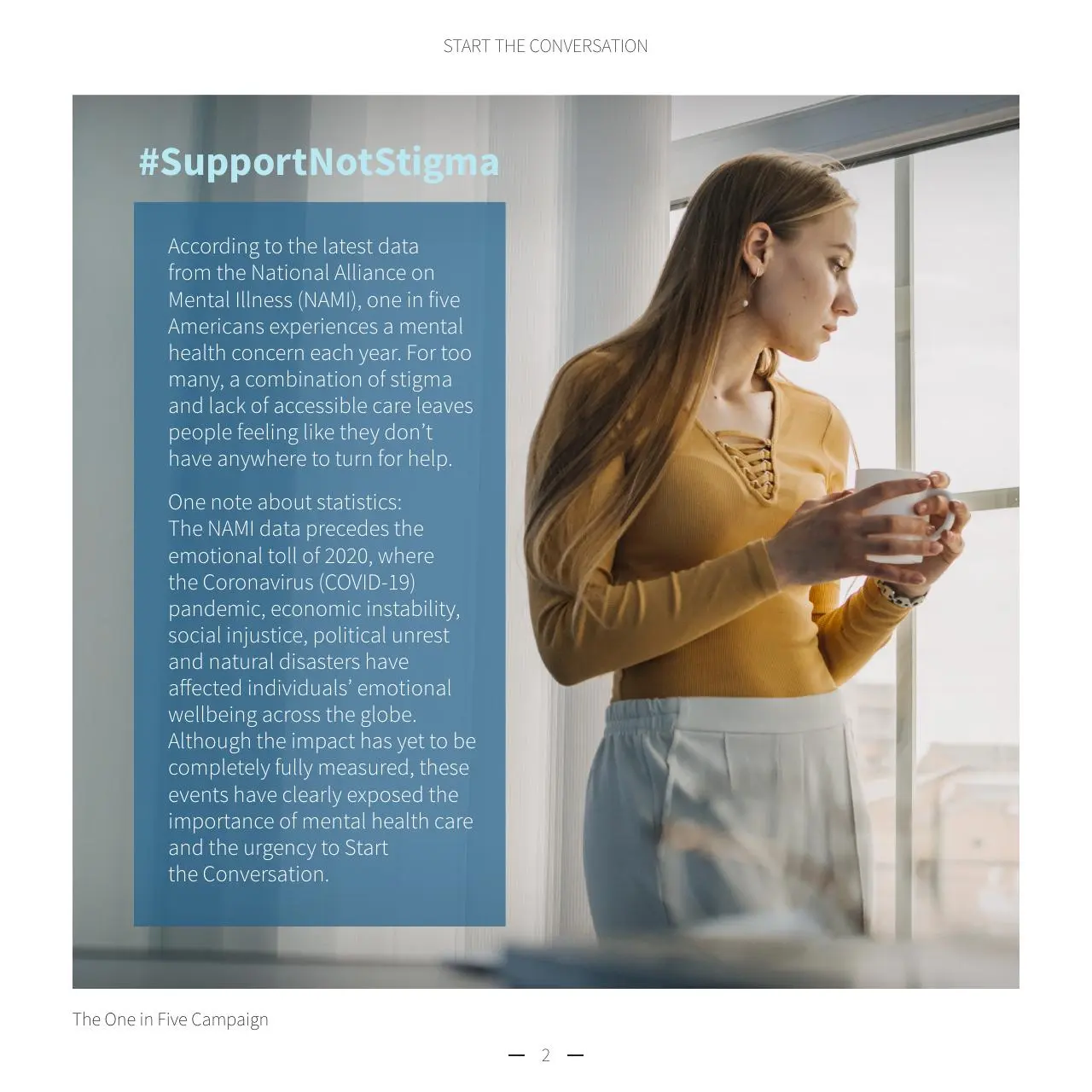
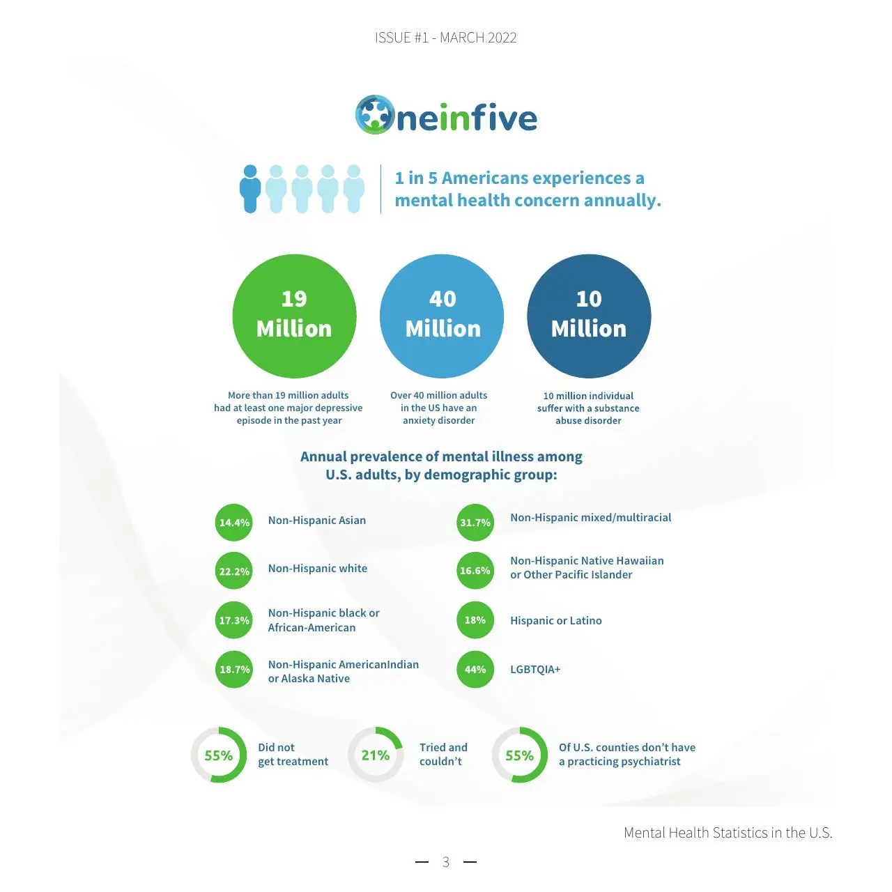
Context and scaleCampaign framing leads into a structured data page without breaking the visual narrative.
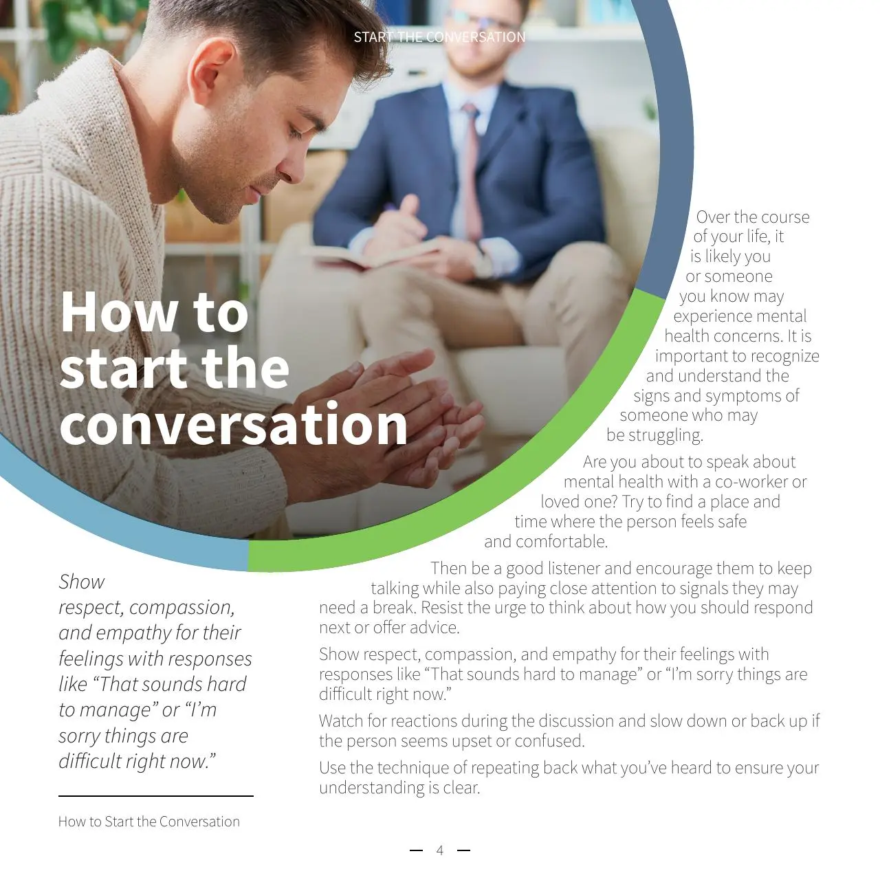
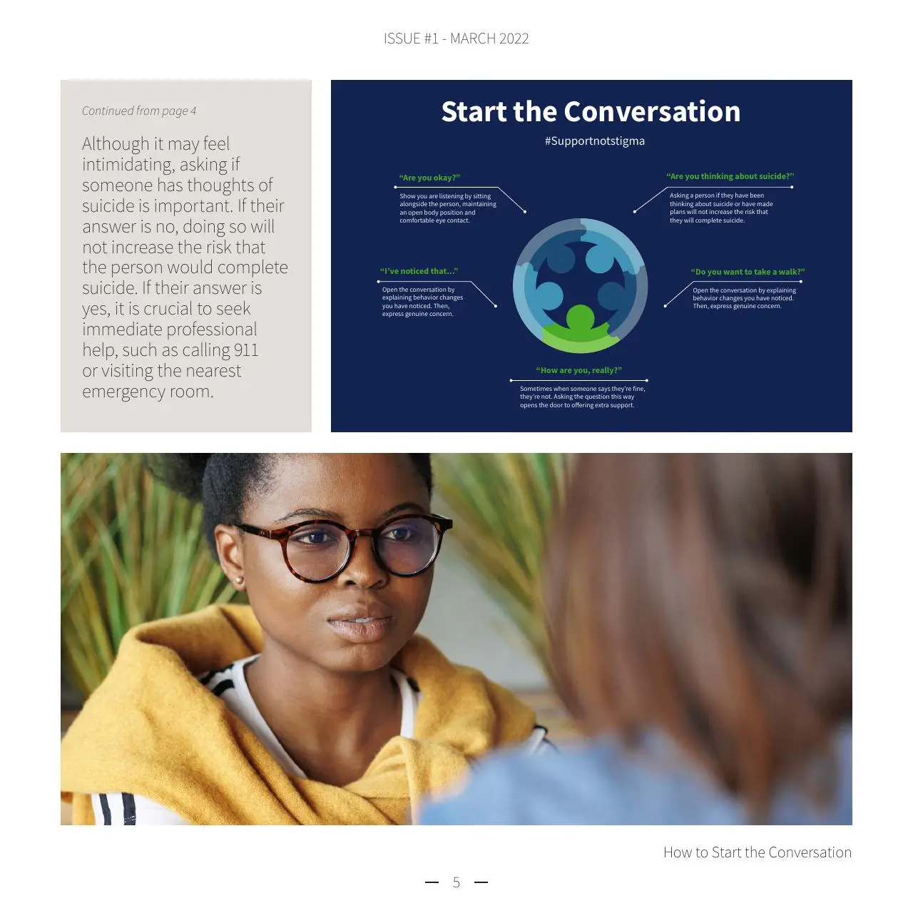
Practical guidanceLarge editorial typography, concise prompts, and supporting photography turn advice into a usable reading sequence.
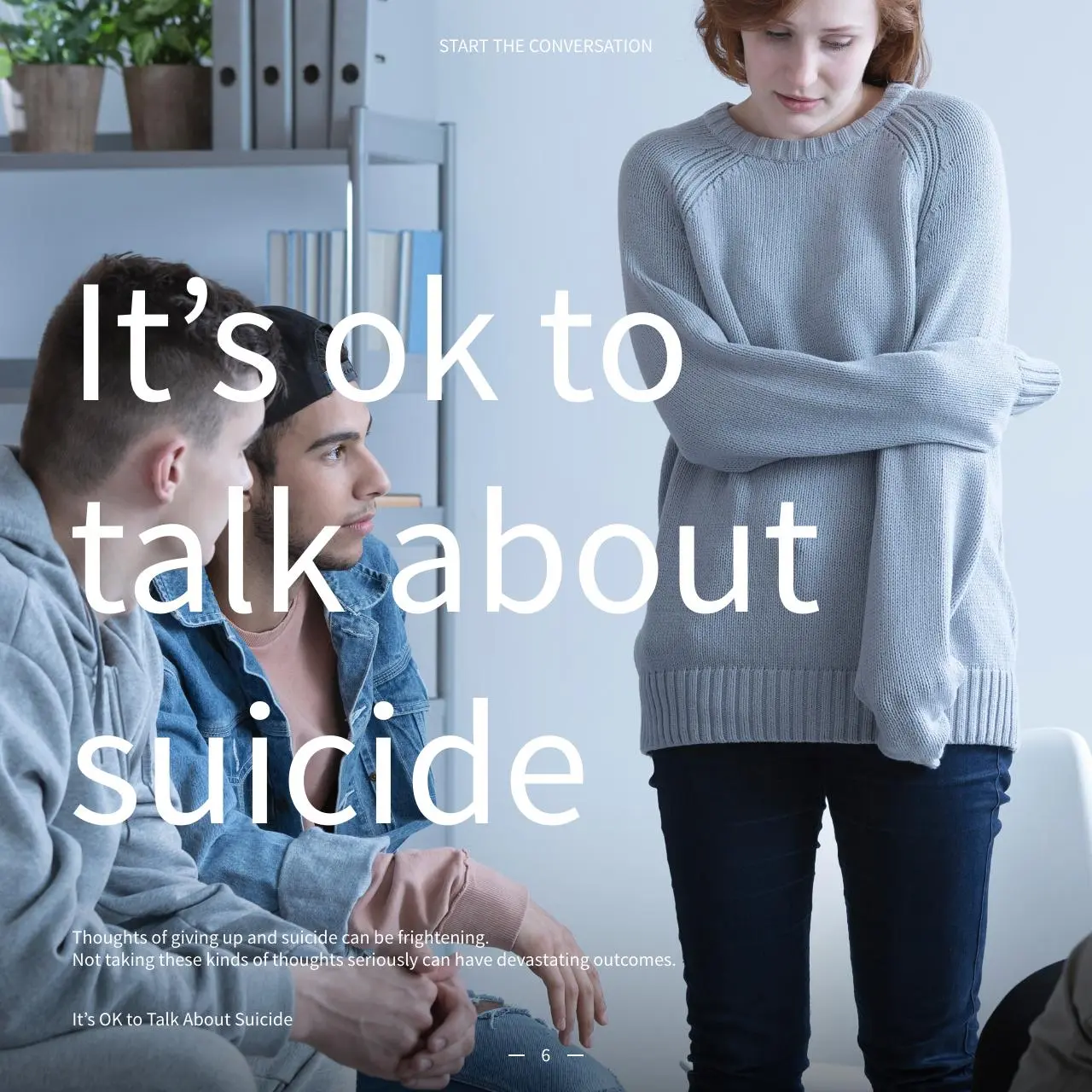
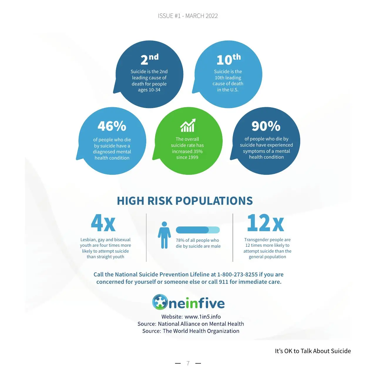
A more serious registerThe same system shifts tone for suicide awareness while preserving hierarchy and campaign recognition.
Connected, not duplicated
The idea changed shape without losing its identity.
The booklet established the campaign's voice and visual ingredients. Flyers reorganized that language for workplace handouts and webinar details. Social posts reduced it to one fact, one human image, and one action.
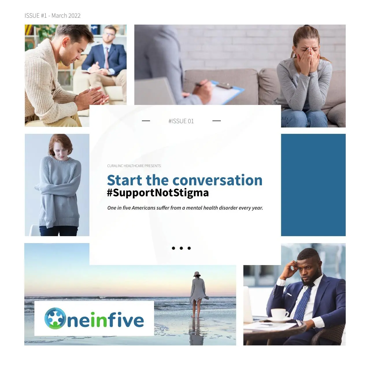
Booklet
Editorial depth and evergreen guidance
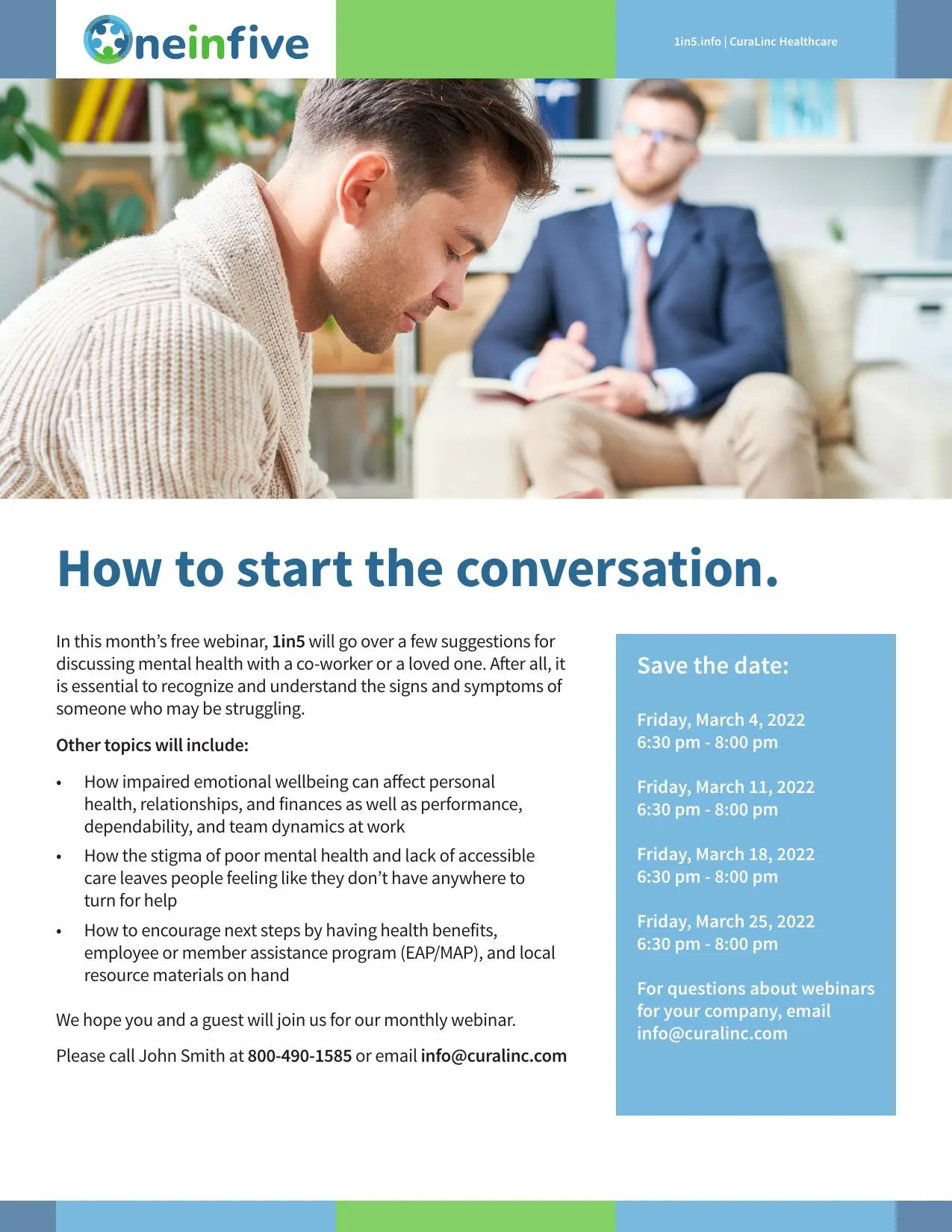
Flyer
Workplace distribution and event detail

Social post
Immediate fact and campaign entry point
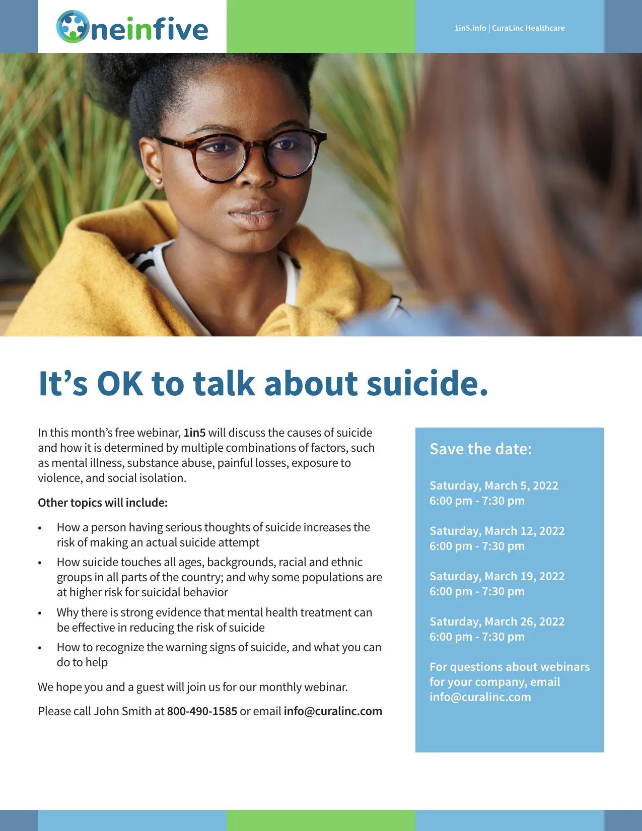
Related topic, shared structureThe flyer system accommodates a more serious message while keeping the event information predictable.
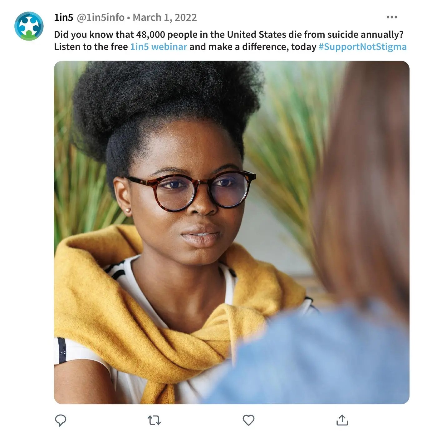
Channel-ready adaptationPhotography and a concise statistic carry the same topic into a fast-reading social format.
Build an editorial anchor
Use the booklet to establish the campaign's information hierarchy, pacing, and visual language before extending it into shorter formats.
Make difficult content approachable
Balance direct language, generous space, human photography, and clear infographics so serious subjects remain readable without feeling clinical.
Adapt instead of shrink
Recompose the same system for letter-size handouts and square social posts, preserving recognition while respecting each channel's reading behavior.
From an open brief to a system ready for production.
I developed the concept, sketched and tested layout directions, designed the booklet and supporting campaign pieces, prepared print and electronic specifications, and presented the complete system during a second-round interview.
The Oneinfive identity, supplied copy, campaign statistics, and infographics provided the starting materials. I selected licensed stock imagery and created the layouts and supporting graphics in Adobe InDesign and Illustrator.
This was an independent interview design exercise, not commissioned or published client work. The page evaluates the strength of the concept and production thinking without implying that CuraLinc launched the campaign.
Results
06 · Result
The strongest result was not another deliverable. It was proof that the original idea could become a system.
The completed presentation showed a coherent family of production-ready concepts across editorial, workplace, and social formats. It demonstrated content organization, visual continuity, channel adaptation, and the ability to explain design decisions clearly.